

Post #50:
This guide is your gateway to a wealth of knowledge, offering simple yet powerful strategies to optimize visuals and enhance the overall user experience. Learn to navigate the challenges of mobile design, from crafting intuitive navigation that guides users effortlessly to creating responsive layouts that adapt to a variety of devices. Whether you're an experienced designer or just starting out, our guide provides the tools and insights to help you create polished and engaging mobile interfaces.
Dive deep into the intricacies of mobile design, exploring the importance of every pixel and the role each interaction plays in shaping a seamless user journey. Gain a nuanced understanding of the unique challenges posed by smaller screens and diverse device capabilities, and discover how to turn these challenges into opportunities for creating exceptional mobile experiences.
This journey into "Designing for Mobile" goes beyond the surface, delving into the principles of creating visually stunning and user-friendly mobile interfaces. Whether you're focused on app development, website design, or any other mobile-oriented project, our guide empowers you to master the art of mobile design and stand out in the crowded digital landscape.
Join us as we demystify the process, providing actionable insights and hands-on tips to ensure that your designs not only meet but exceed the expectations of mobile users. Your creations will captivate audiences and perform effortlessly on a diverse array of mobile devices, making your mark in the dynamic world of mobile design.
Prioritize Clarity and Simplicity
Start by simplifying your design elements. Opt for a clean and straightforward visual language that ensures clarity, making it easy for users to navigate and understand your content on smaller screens.
Optimize for Touch Interaction
Consider the touch-centric nature of mobile devices. Ensure that buttons and interactive elements are adequately sized and spaced for easy tapping, providing a seamless and frustration-free user experience.
Responsive Design is Key
Embrace responsive design principles. Ensure that your layouts and content adjust gracefully to different screen sizes, allowing users to access your content in a visually appealing way, whether on a smartphone or tablet.
Streamlined Navigation
Simplify your navigation menu. Opt for a straightforward and intuitive menu structure that doesn't overwhelm users. Utilize collapsible menus or navigation icons for a cleaner look and ease of use.
Optimize Image and Media Files
Compress and optimize images and media files to reduce load times. Mobile users appreciate swift loading, and optimizing files ensures a faster, more enjoyable browsing experience.
Consistent Branding Across Devices
Maintain consistent branding across various devices. Ensure that your logo, colors, and overall brand identity remain cohesive, providing a unified experience for users regardless of the device they use.
Font Legibility
Choose legible fonts for smaller screens. Ensure that text is easy to read without zooming in, maintaining a comfortable reading experience for mobile users.
Minimalist Design Approach
Embrace a minimalist design approach. Focus on essential elements and prioritize the most critical information. A clutter-free design enhances usability on smaller screens.
Test Across Multiple Devices
Test your designs across a variety of mobile devices and screen sizes. This ensures that your design remains consistent and functional, providing a positive experience for users regardless of their device.
User Feedback Integration
Solicit and integrate user feedback. Actively seek input from users accessing your designs on mobile devices and make adjustments based on their experiences, fostering a user-centric design approach.
By following these steps, designers can create mobile-friendly visuals that are not only elegant but also provide a seamless and enjoyable experience for users on smaller screens. The emphasis is on simplicity, responsiveness, and user-centric design principles.
on art and home decor (5)
on communication (2)
on design (4)
on painting (1)
on planning (3)
on social media (2)
on writing (5)


privacy policy |
terms of use |
product terms |
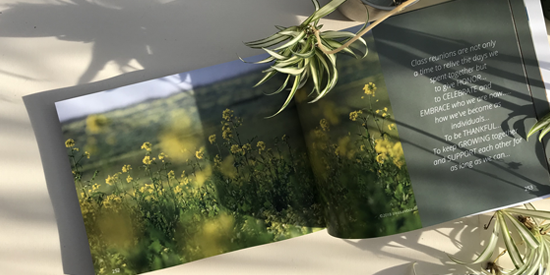
photobook |
unsubscribe |
site map |
faqs |
connect
©Artworldnet, Inc. All rights reserved.