

Post #56:
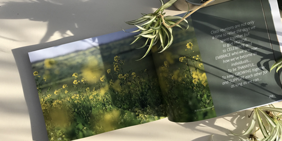
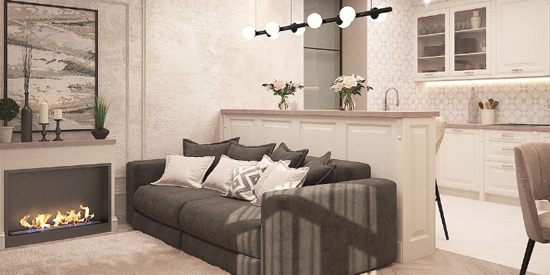
Explore 'Mastering Minimalism: Essential Design Tips' and learn to harness the beauty of simplicity, transforming your creations with timeless elegance. This insightful guide offers practical techniques to declutter your designs, optimize user experience, and achieve striking visual harmony. Whether you're a seasoned designer or just starting out, discover how less can truly be more.
Clarify Your Purpose
Define the core message or function your design needs to convey or serve. Minimalism is about focusing on essentials, so clarity of purpose is crucial from the outset.
Simplify Elements
Strip away unnecessary elements that don’t contribute to the core message or functionality. Aim for simplicity in shapes, colors, and overall design elements.
Embrace White Space
Utilize white space (or negative space) intentionally to create breathing room and highlight key elements. This enhances readability and visual appeal.
Limit Color Palette
Choose a limited color palette that complements your message or brand identity. Restricting colors maintains visual harmony and emphasizes important elements.
Typography: Less is More
Opt for clean, easy-to-read fonts. Use a minimal number of font styles and sizes to maintain consistency and readability across different devices.
Focus on Functionality
Prioritize functionality over embellishment. Ensure every design element serves a clear purpose and enhances the user experience.
Hierarchy and Contrast
Establish a clear hierarchy through the size, weight, and placement of elements. Use contrast to guide attention and distinguish between different levels of information.
Use of Grids
Employ grids to organize content and maintain alignment. Grids provide structure and help achieve a balanced layout.
Iterate and Refine
Continuously review your design and iterate based on feedback. Minimalism doesn’t mean static; it involves refining until you achieve the perfect balance between simplicity and effectiveness.
Test Across Devices
Ensure your minimalist design is responsive and looks great across various screen sizes and devices. Consistency in experience is key to effective minimalistic design.
By following these steps, you can effectively master minimalism in your design, creating visually appealing and purposeful experiences that resonate with your audience.
on art and home decor (5)
on communication (2)
on design (4)
on painting (1)
on planning (3)
on social media (2)
on writing (5)
